Time Series widget
Last updated
Last updated
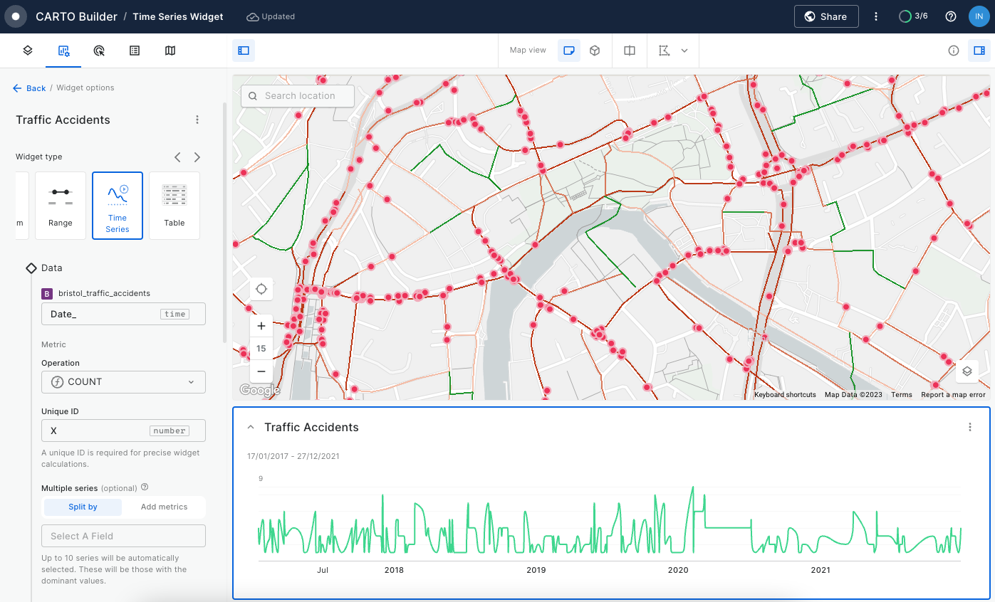
Time Series Widget allows you to identify insights and patterns from your data over a period of time. To use it, ensure your data source includes a valid timestamp.
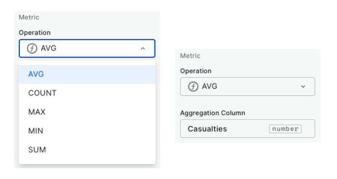
When configuring a Time Series Widget, you have the flexibility to choose from a provided aggregation list that includes COUNT
, AVG
, MAX
, MIN
, and SUM
to define the metric to be displayed in the widget.
Multiple series can be visualized in the widget to compare trends. You can create multiple series using one of the following options: "Split by" and "Add metrics"
Split by: To split a single series into multiple segments, simply specify a "Split by" category field. For instance, in a dataset tracking traffic accidents, you define your primary metric as the "COUNT" of records and use the "Split by" category column as "accident_severity". The widget will then present the "COUNT" of each unique accident severity category as separate series.
Add metrics: If you want to incorporate more data dimensions into your visualization, utilize the "Add metrics" option. For example, in a traffic accident dataset, you can define your initial metric as the "SUM" of cycles affected at accident spots. Subsequently, you can add another metric to calculate the "SUM" of motorcycles affected. The resultant widget will display two distinct series: one representing the sum of cycles and the other representing the sum of motorcycles for each specified time interval.
Note that the Time Series widget can support up to 10 different series. When using split by option, the most dominant categories will be automatically selected.
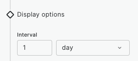
Temporal data is organized into discrete time intervals along the x-axis of the widget. By default, an interval size is automatically selected, but you have the flexibility to manually adjust it as needed.
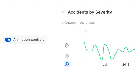
You can empower users to animate moving geometry features by adding animation controls. You can click the clock icon to adjust speeds: 0.5x, 1x, 2x, or 3x.
Animation support on the Time Series widget is currently not available for aggregated sources such as point aggregated such as heatmap, cluster, etc. or aggregated spatial index sources such as h3 or quadbin.
In the display section, you can also use formatting to choose the unit of metrics displayed on the y-axis. Additionally, you can add notes that support Markdown syntax.
Within the "Behavior" section, you can define how your widget operates: choose between "Viewport" or "Global" modes. Additionally, you can make your widgets collapsible, allowing you to hide them when needed.
Moreover, you can conveniently enabled or disabled the filtering capability of your widget by using the cross-filtering toggle icon.
Learn more about widget behavior here.
When dealing with temporal data sources, we advocate the following best practices:
Large temporal data: When working with large temporal data, consider aggregating your data to a higher temporal granularity and using Time Series Widget in combination with Date SQL Parameter. These recommendations can help reduce the volume of data and enhance performance
Static geometries: If you are working with static geometry whose attributes change over time, we recommend you aggregate your source grouping by geometry to avoid displaying duplicated geometries on the map. You can also leverage the "Date" type of SQL Parameter to dynamically define the date range of your source.
Animation: Animation is primarily recommended for geometries that exhibit movement over time. If you are interested on animation for static geometry whose attributes vary over time please let us know.
Time Series Widget is not available for pre-generated Tilesets . Note also that only one Time Series Widget per map is permitted.