> For the complete documentation index, see [llms.txt](https://docs.carto.com/llms.txt). Markdown versions of documentation pages are available by appending `.md` to page URLs; this page is available as [Markdown](https://docs.carto.com/carto-user-manual/maps/layers.md).
# Layers
Layers in Builder are connected to data sources and are used to render features on a map by directly connecting to your data warehouse. Once a data source is added to Builder, a layer is automatically added for that data source. If the spatial definition is valid, the features will be rendered on the map. Learn more about defining source spatial data in this [section](/carto-user-manual/maps/data-sources/defining-source-spatial-data.md).
## Layer options
When working with layers in Builder, you have the following options:
* **Zoom to:** Zoom to the layer extent, taking into account any filtering applied in Widgets and/or Parameters when applicable.
* **Show only this/Show all layers:** Easily set layers visibility on and off.
* **Layer style:** Access the layer panel to set your layer styling configuration.
* **Duplicate layer**: Duplicate a layer with the same styling properties.
* **Rename:** Edit the name of your layer.
* **Delete**: Remove the layer and its corresponding source.
## Layer groups
When a map has many layers, you can organize them into named, collapsible **groups**. Groups appear in both places your layers show up, the **layer panel** while you build and the **legend** your viewers see, so the same structure keeps a busy map readable on both sides. Grouping is an organizational tool, so it never changes your data or how individual features are styled.
### Creating and managing groups
From the layer panel you can:
* **Create group:** Open the add menu in the layer panel and choose **Create group** to add a new group. New groups get a default name that you can edit at any time.
* **Add to group / Move to group:** From a layer's options menu, choose **Add to group** to place it in an existing group, or drag the layer onto the group. Use **Move to group** to send a grouped layer to a different group.
* **Remove from group:** Return a layer to the top level of the layer list.
* **Rename:** Click the group name to edit it.
* **Expand / Collapse:** Fold a group to tuck its layers away in the panel, or expand it to see them again. This only changes the panel, not the map.
* **Delete group:** Remove the group. Its layers return to the top level of the list. Deleting a group never deletes your layers or data.
You can also reorder layers and groups by dragging them within the panel. The order in the panel sets the drawing order on the map, with layers at the top drawn above the ones below.
### Group visibility
Each group has its own visibility control:
* **Hide group / Show group:** Turn every layer in the group off or on at once. A group's visibility combines with each layer's own visibility, so a layer is drawn on the map only when both the group and the layer are set to visible.
* **Show only this:** Show the layers in this group and hide everything else, so you can focus on one part of the map.
* **Zoom to:** Frame the map around the layers in the group.
In the [legend](/carto-user-manual/maps/legend.md), groups appear as labelled sections that mirror the layer panel, so the people you share the map with get the same organized view rather than a flat list.
## Visualization types
The spatial definition of the source linked to a layer specifies the layer visualization type and additional visualization and styling options. The different layer visualization types supported in Buider are:
* [**Point**](/carto-user-manual/maps/layers/point.md): Displays as point geometries. Point data can be dynamically aggregated to the following types:
* [**Grid**](/carto-user-manual/maps/layers/point/grid-point-aggregation.md)**:** Aggregated point geometry to grid.
* [**H3**](/carto-user-manual/maps/layers/point/h3-point-aggregation.md): Aggregated point geometry to hexagonal cells.
* [**Heatmap**](/carto-user-manual/maps/layers/point/heatmap-point-aggregation.md): Aggregated point geometry by density.
* [**Cluster**](/carto-user-manual/maps/layers/point/cluster-point-aggregation.md)**:** Aggregated point geometry by circles.
* [**Polygon**](/carto-user-manual/maps/layers/polygon.md): Displays as polygon geometries.
* [**Line**](/carto-user-manual/maps/layers/line.md): Displays as line geometries.
* [**Grid**](/carto-user-manual/maps/layers/grid.md)**:** Displays features as grid cells.
* [**H3**](/carto-user-manual/maps/layers/h3.md): Displays features as hexagon cells.
* [**Raster**](/carto-user-manual/maps/layers/raster.md): Displays a grid of pixels.
### Visibility by zoom level
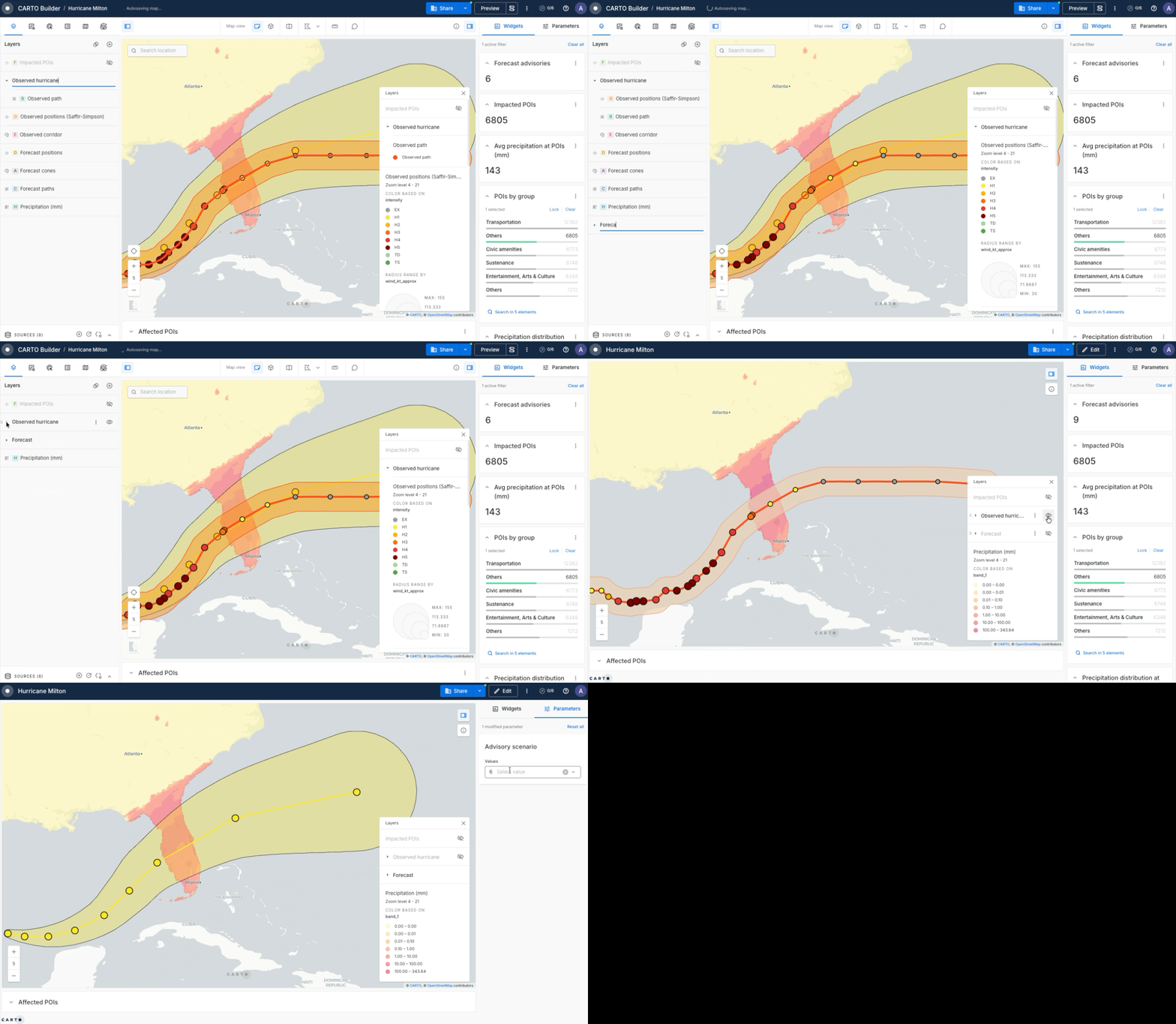
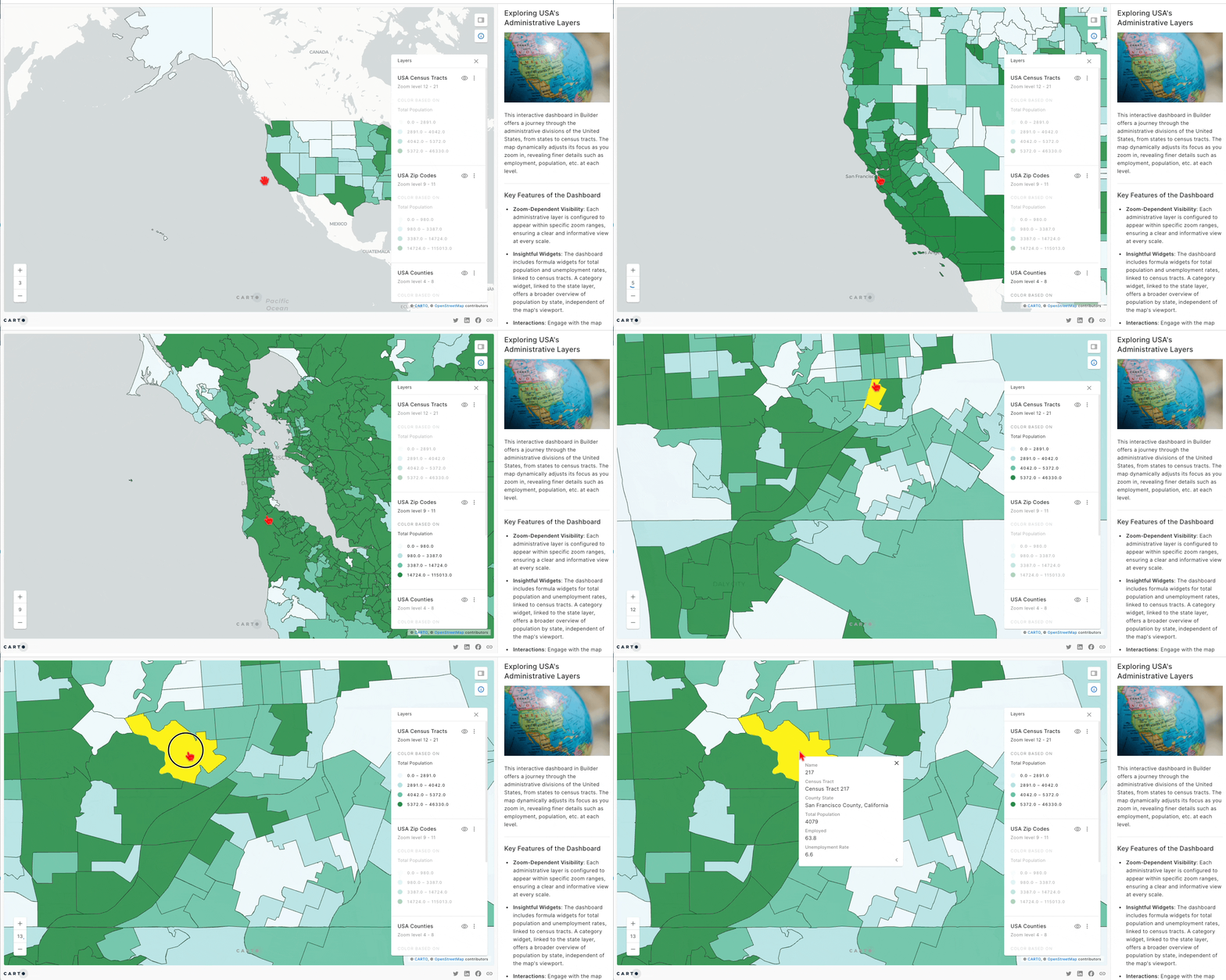
Control the zoom range where a layer should be visibile. This is useful for combining different type of sources, such as aggregated data for lower zoom levels and non-aggregated data for higher levels or visualizing different administrative levels.
### Aggregate by geometry
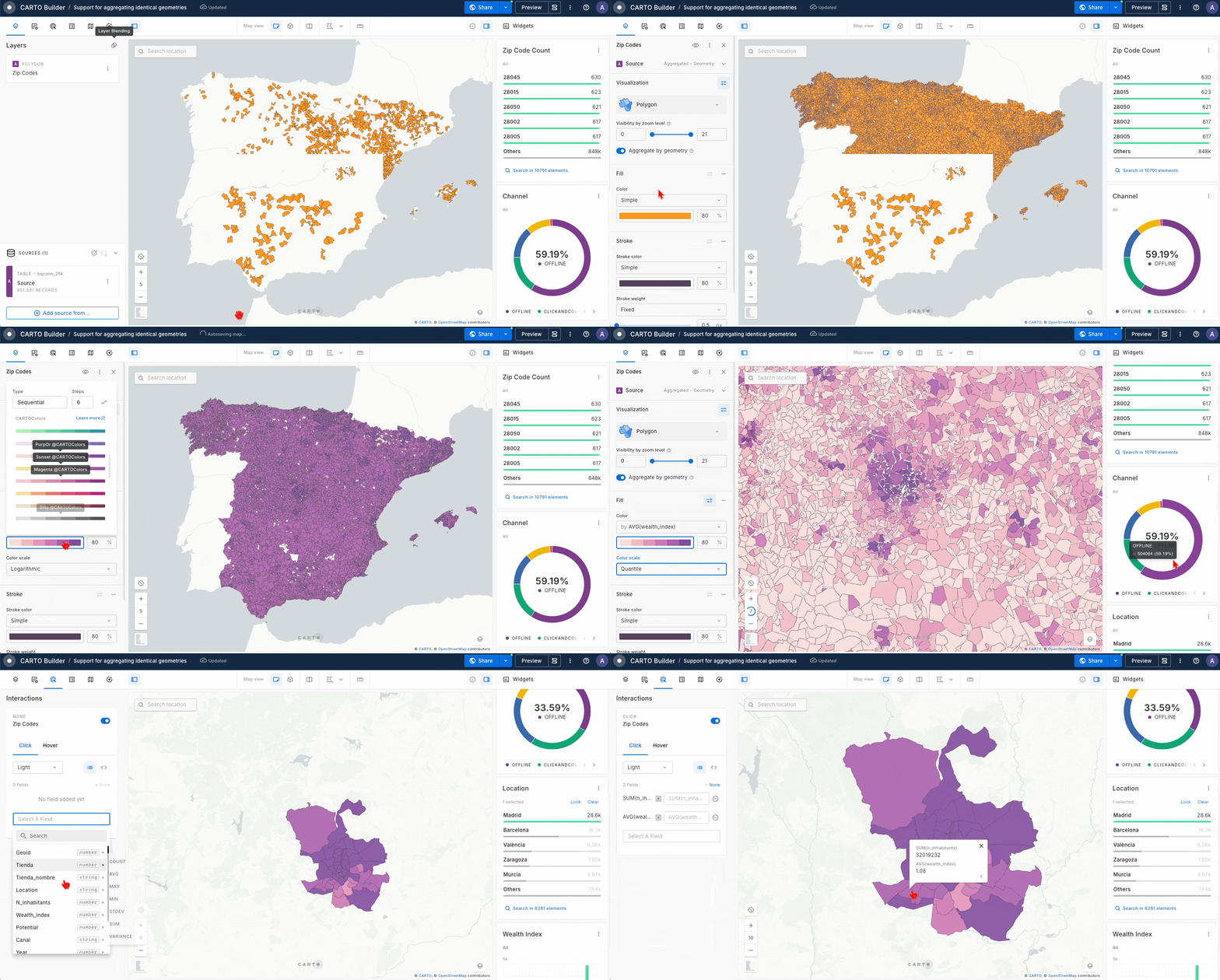
If you are working with point, polygon or line layer visualization types containing identical geometries with varying attributes (e.g., weather stations or buildings), you can use the **Aggregate by geometry** functionality to aggregate your layer based on a distinct spatial column. This allows you to:
* Aggregate geometries in your layer ensuring an optimal performance.
* Aggregate styling and interaction attributes to retrieve relevant information link to your aggregated feature.
* Maintain widgets functionality over the original source, enabling drill-down operations for deeper insights.
For derived metrics like rates, ratios and weighted averages, **Aggregate by geometry** also supports [custom SQL aggregation expressions](/carto-user-manual/maps/layers/point.md#custom-aggregation-expressions) on styling channels and popup fields. Available on [point](/carto-user-manual/maps/layers/point.md#custom-aggregation-expressions), [line](/carto-user-manual/maps/layers/line.md#custom-aggregation-expressions) and [polygon](/carto-user-manual/maps/layers/polygon.md#custom-aggregation-expressions) layers.
## Layer styling
Layer styling is essential for making your maps informative and engaging. Below are generic aspects of visualization and styling options available in Builder. For more detailed styling capabilities for a specific layer type, we recommend to check each layer type as defined above.
### Labels
Text labels add typographic detail to your map, helping you communicate feature names or values directly on the Map View. Labels are available for **point, polygon, and line** layers.
Enable the **Labels** option in the layer panel, choose the column to display, and adjust **Font Size**, **Font Color**, **Text Anchor**, and **Placement**. CARTO places each label automatically, at the center of every polygon and along the middle of every line.
For **line** layers you can also set a **unique ID field**. A line feature is often split across several map tiles, which would otherwise produce one label per tile. Choosing a column that identifies each feature, such as a road name or ID, keeps a single label per feature.
### Color palettes
When styling layers in Builder, you can choose a few different types of **color palettes**:
* **Diverging:** Highlight values that are above and below an interesting mid-point in quantitative data. This is a great way to show data values that differ greatly from the norm. For example, you may use a diverging colour scheme to show population change.
* **Sequential:** Ideal for data that follows an order, often numeric ranging from low to high. For example, you may use a sequential colour scheme to show counts within a H3 grid.
* **Qualitative:** Represents different categories of data. For example, a qualitative scheme is a good choice for showing different types of Points of Interest.
* **Singlehue:** Gradual transition of a single color from light to dark. For example to visualize the quality network coverage signal.
* **Custom:** Pick a new color either by clicking on the color picker or inputting HEX/RGB values. Color steps can be added, removed and shuffled.
{% hint style="info" %}
When working with [**aggregated data sources**](/carto-user-manual/maps/data-sources.md#aggregated-grids), you will need to select an aggregation operation for your columns.
Connections to **Redshift** clusters only support aggregation of categorical properties by any value.
{% endhint %}
Admins can also create **custom color palettes** from the organization settings. These are reusable color schemes and they are available to the whole organization, removing the need to define a new custom palette every time a custom set of colours is used for styling.
For more information, see our [article on custom color palettes](/carto-user-manual/settings/customizations/configuring-custom-color-palettes.md).
### Color schema by HexColor
You can also tap into the **HexColor** feature to style qualitative data using the hex color codes from either your table or SQL query source. To harness this capability:
1. Navigate to the *Color based on* selector and choose the text column you want to associate with the hex color code.
2. In the *Palette* section, select the 'HexColor' option.
3. Finally, choose the column containing the hex color code values.
For more information about how to leverage this functionality see this [tutorial](https://academy.carto.com/building-interactive-maps/data-visualization/style-qualitative-data-using-hex-color-codes).
{% hint style="warning" %}
**Pre-generated tileset** layers styled with HexColor are not currently supported in the legend. If you require this functionality, please provide feedback through your CARTO point of contact.
{% endhint %}
### Color Scale
The *Data classification method* selector controls how the values in your column are matched to the colors in your palette. The methods available depend on the type of column.
| Column type | Available methods |
| --------------------------- | --------------------------------------- |
| Numeric (numbers and dates) | Quantize, Quantile, Logarithmic, Custom |
| Text (categories) | Ordinal (dynamic), Custom |
#### Numeric columns
The number of colors in your palette sets the number of classes. To change the number of classes, add or remove steps in the palette.
* **Quantize**: Splits the range between the minimum and maximum values into classes of equal length. Use it when the values are evenly spread and you want each class to cover the same span.
* **Quantile**: Puts the same number of features in each class. There are no empty classes, but similar values can end up in different classes and very different values can end up in the same class.
* **Logarithmic**: Creates classes based on powers of `10`, based on the number of steps in the selected color palette. Use it when a few features have much higher values than the rest. Logarithmic scales tend to work well with [aggregated data sources](/carto-user-manual/maps/data-sources.md#aggregated-grids).
* **Custom**: Lets you set the break values for each class yourself. Use it to fine tune a color ramp or to match thresholds that are meaningful for your analysis. Your breaks are saved with the map, so they stay the same when the data changes.
#### Text columns
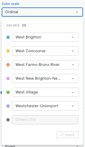
* **Ordinal (dynamic)**: Builder assigns the colors of your palette to the most frequent categories in your data, in order. The first color goes to the most frequent category, the second color to the next one, and so on. Categories beyond the number of colors in your palette are shown in gray as *Others*. The colors are recalculated from the data every time the map loads, so if the data changes, a category can get a different color.
* **Custom**: You choose which category gets each color. Each row of the palette shows a color and a category selector. Pick a category for each row, and click *Apply*. Selecting a category that is already assigned to another row swaps the two. Categories without a color are shown in gray as *Others*. Your color and category pairs are saved with the map, so each category keeps its color even when the data changes.
{% hint style="info" %}
Use **Custom** when the data in your map is updated regularly, for example by a scheduled [workflow](/carto-user-manual/workflows.md). Each category keeps its color after every update. New categories that appear in the data are shown as *Others* until an Editor assigns them a color.
{% endhint %}
You can assign colors to up to 20 categories, one per palette step. To color more categories, add steps to your palette.
Each category keeps its color when you sort the legend alphabetically or by value. See [Sort categorical legends](/carto-user-manual/maps/legend.md#sort-categorical-legends) for details.
{% hint style="info" %}
When working with [**aggregated data sources**](/carto-user-manual/maps/data-sources.md#aggregated-grids), the available methods depend on the aggregation operation. `COUNT` only offers Custom. Numeric aggregations such as `SUM` or `AVG` offer the numeric methods. `MODE` and `ANY_VALUE` return categories and offer the text methods.
{% endhint %}
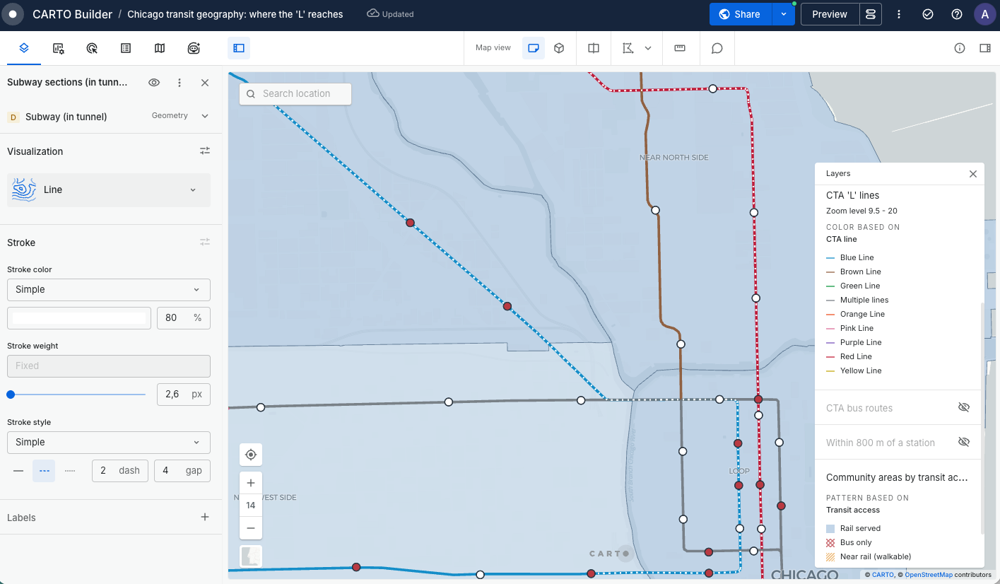
### Stroke styles
By default, lines and polygon borders are drawn as a continuous line. You can change this in the **Stroke** section by choosing a stroke style:
* **Solid**: A continuous line. This is the default.
* **Dashed**: A broken line. You can set the length of the dashes and the length of the gaps between them.
* **Dotted**: A line made of rounded dots. You can set the spacing between the dots.
Stroke styles are available on **line** layers and on **polygon** borders, and they work alongside the stroke color and stroke weight settings. Dash and gap lengths are relative to the stroke weight, so the pattern keeps its proportions when you make the line thicker or thinner, and when you zoom in and out.
You can also set the stroke style **based on a property**, using the **Ordinal** classification method to assign a style to each category. This lets you use one column for the stroke color and another for the stroke style, for example showing road type as a style and traffic volume as a color.
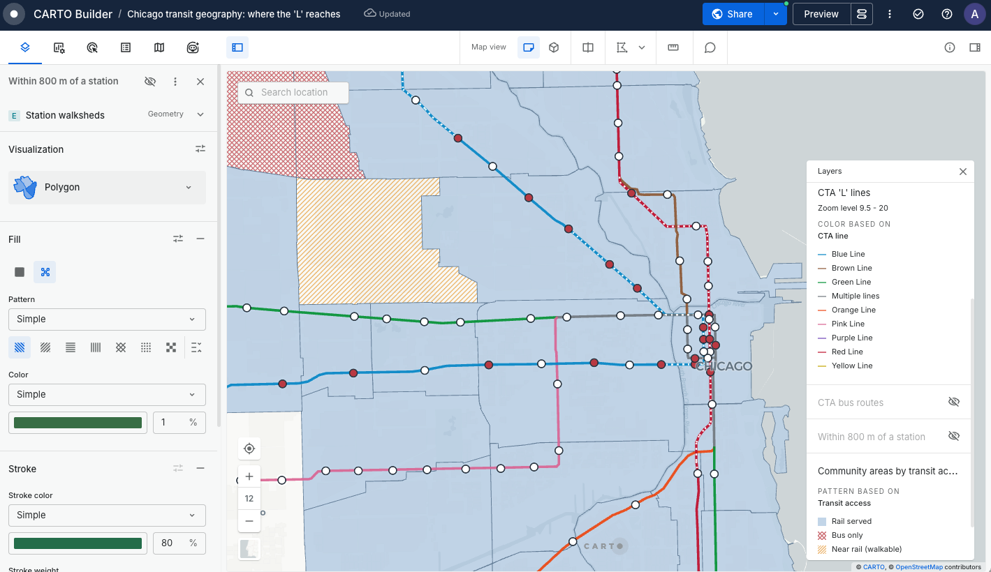
### Fill patterns
On **polygon** layers, the **Fill** section starts with a choice between **Solid fill** and **Pattern**. With **Pattern** selected, your polygons are filled with a repeating pattern instead of a flat color:
* **Horizontal lines** and **Vertical lines**: Straight lines in one direction.
* **Forward diagonal** and **Backward diagonal**: Diagonal lines leaning either way.
* **Cross-hatch**: Crossing diagonal lines.
* **Dots**: A dotted texture.
* **Checkerboard**: Alternating squares.
For each pattern you can also control its size in two ways:
* **Pattern density**: A preset of small, medium or large, which sets how tightly the pattern repeats.
* **Pattern scale**: Fine-tunes the size of the pattern on top of the density. The pattern is sized in map units rather than screen pixels, so it grows as you zoom in and shrinks as you zoom out. Choose a scale that reads well across the zoom levels your audience will use, and if the pattern becomes too coarse close in, consider limiting the zoom range the layer is visible at.
The pattern is drawn in the color set in the Fill section, and the space between the pattern strokes is transparent, so layers underneath remain visible. If you want a pattern over a solid background, add the same source twice: a solid-fill layer below and a patterned layer above.
You can also set the pattern **based on a property**, using the **Ordinal** classification method to assign a pattern to each category. In this mode two extra options are available per category: **Solid**, which paints that category as a flat color, and **No fill**, which leaves it unpainted.
Switching between **Solid fill** and **Pattern** does not discard your settings, so you can go back and forth without reconfiguring the pattern.
Stroke styles and fill patterns are both reflected in the map [legend](/carto-user-manual/maps/legend.md), so the people you share the map with can read them.
### 3D visualization using Height
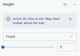
Builders allows you to assign heights to build 3D visualization for both polygons and spatial index sources. You can activate this option in the Height section, using the slider to define a fix value or using a property to define the height.
When using the Height functionality, remember to activate the 3D view with the 3D toggle in the basemap selector, in the bottom-right corner of the map. Using this, you can achieve stunning visualizations as per below map.
{% embed url="" %}
Explore a map with 3D polygons whose height is defined by the number of floors.
{% endembed %}
## Layer blending
Layer blending is a technique used to determine how overlapping features in different layers interact in terms of their visual representation. When two layers are blended, you can select the following blending options:
* **Additive:** This mode adds the color values of overlapping features. When two colors are added together, the resulting color is often lighter. This blending mode is commonly used to visualize densities or intensities.
* **Subtractive:** This blending mode subtracts the color values of the upper layer from the layer beneath it. The result is typically a darker color. In some contexts, this mode can help emphasize differences between layers.
---
# Agent Instructions
This documentation is published with GitBook. GitBook is the documentation platform designed so that both humans and AI agents can read, navigate, and reason over technical content effectively. Learn more at gitbook.com.
## Querying This Documentation
If you need additional information that is not directly available in this page, you can query the documentation by asking a question.
Perform an HTTP GET request on the following URL with the `ask` and `goal` query parameters:
```
GET https://docs.carto.com/carto-user-manual/maps/layers.md?ask=&goal=
```
`ask` is the immediate question: it should be specific, self-contained, and written in natural language.
`goal` is what the user is ultimately trying to achieve, the reason they need the answer. Sharing it helps GitBook give you a better, more relevant answer. A goal is most helpful when it describes the outcome the user wants rather than restating the question. For example, with `ask=how do I create an API token`, a goal like `automate deployments from our CI pipeline` lets GitBook tailor the answer to that use case.
The response will contain a direct answer to the question and relevant excerpts and sources from the documentation.
Use this mechanism when the answer is not explicitly present in the current page, you need clarification or additional context, or you want to retrieve related documentation sections.