> For the complete documentation index, see [llms.txt](https://docs.carto.com/llms.txt). Markdown versions of documentation pages are available by appending `.md` to page URLs; this page is available as [Markdown](https://docs.carto.com/carto-user-manual/settings/quotas-and-rate-limits/usage-analytics.md).
# Usage analytics
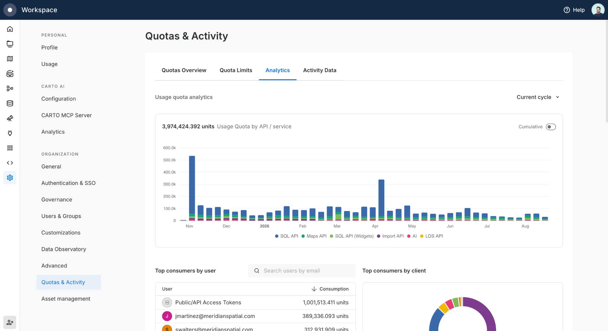
Track how your organization consumes its [Usage quota](/carto-user-manual/settings/quotas-and-rate-limits/understanding-your-organization-quotas.md#usage-quota) from **Settings > Quotas & Activity > Analytics**. The dashboard shows consumption over time and breaks it down by API, user, client, map, and workflow, so you can see what is driving your usage without exporting any data.
## Usage quota over time
The main chart plots Usage quota consumption across the selected period, stacked by the CARTO API/service that produced it (Maps API, SQL API, SQL API Widgets, Import API, AI, and LDS API). These are the same APIs described in [API Usage](/carto-user-manual/settings/quotas-and-rate-limits/understanding-your-organization-quotas.md#api-usage).
Use the selector in the top right to change the time frame: current cycle, past month, past 3 months, or past year. Toggle **Cumulative** to switch between consumption per period and a running total that builds up across the range.
## Consumption breakdowns
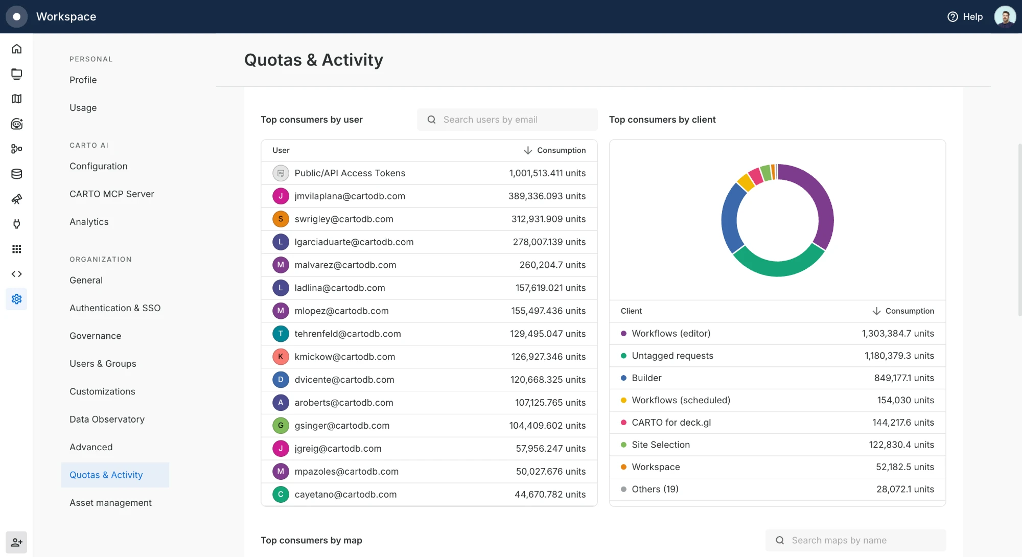
Below the chart, ranked tables show who and what is consuming your quota:
* **By user**, consumption per user. `Public/API Access Tokens` groups traffic that isn't tied to a signed-in user, such as public maps and requests made with [API Access Tokens](/carto-user-manual/developers/managing-credentials/api-access-tokens.md).
* **By client**, the CARTO surface that generated the usage, such as Builder, Workflows, or CARTO for deck.gl.
* **By map** and **by workflow**, the individual maps and workflows driving consumption.
Each table has a search box to find a specific user, client, map, or workflow by name.
## Drill into a period
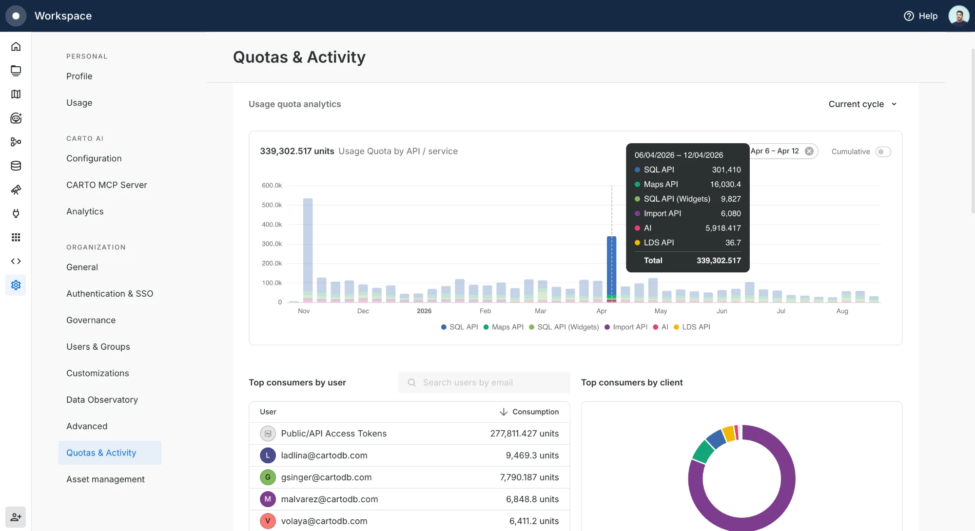
Click any bar in the chart to scope the breakdowns to that period. A tooltip breaks the period down by API, and the ranked tables update to reflect that window only. Clear the selection with the chip above the chart to return to the full range.
{% hint style="info" %}
The Analytics dashboard gives you a quick, visual read on consumption. When you need the raw, granular records to combine with other sources or feed your own BI tools, export them with [Activity Data](/carto-user-manual/settings/activity-data.md).
{% endhint %}
---
# Agent Instructions
This documentation is published with GitBook. GitBook is the documentation platform designed so that both humans and AI agents can read, navigate, and reason over technical content effectively. Learn more at gitbook.com.
## Querying This Documentation
If you need additional information that is not directly available in this page, you can query the documentation by asking a question.
Perform an HTTP GET request on the following URL with the `ask` and `goal` query parameters:
```
GET https://docs.carto.com/carto-user-manual/settings/quotas-and-rate-limits/usage-analytics.md?ask=&goal=
```
`ask` is the immediate question: it should be specific, self-contained, and written in natural language.
`goal` is what the user is ultimately trying to achieve, the reason they need the answer. Sharing it helps GitBook give you a better, more relevant answer. A goal is most helpful when it describes the outcome the user wants rather than restating the question. For example, with `ask=how do I create an API token`, a goal like `automate deployments from our CI pipeline` lets GitBook tailor the answer to that use case.
The response will contain a direct answer to the question and relevant excerpts and sources from the documentation.
Use this mechanism when the answer is not explicitly present in the current page, you need clarification or additional context, or you want to retrieve related documentation sections.